Clean web design: how to use simplicity to amplify your message & build trust

Having a clean, clear and easy-to-navigate website is absolutely essential for small businesses.
This isn’t really a secret. In fact, at Bright Avenue - most of my clients say they want a ‘clean website ’ right at the outset on their discovery calls. Because in a noisy online environment, they know how important it is that their message shines through and they quickly build trust with their website visitors.
Future clients who land on your site may be busy, feeling overwhelmed or (if you are in the health and wellness space) - perhaps even a patient in pain.
A cluttered website will struggle to build trust or hold visitor’s’ attention. And if your website feels busy, not only are you losing their confidence and attention - you’re potentially adding to their mental load as they struggle to find the information they need.
Clean websites also look and feel more trustworthy - and send clear signals that they know what they’re all about, and who they help.
So clean simplicity isn’t just a design choice, it’s a strategy that serves both you and your clients.
Short on time? Jump to:
What exactly do I mean by clean web design?
When I talk about clean web design I’m talking about two things:
Your website aesthetic: the style, layout and overall feel of your website
A clean aesthetic is uncluttered and clear. It utilises generous white space, simple layouts and intentional choices of text, images and graphics. It doesn’t feel busy and - here’s the critical point - it’s unbelievably easy to read and absorb the content.
Your website architecture: how easy your site is to navigate and for visitors to find the information that you’re looking for
This is about how your website works. It’s 2026 and attention spans are shorter than they were ever before. So your website needs to be extremely simple to navigate.
A clean website architecture is all about removing distractions, guiding attention, and creating a clear, balanced structure that supports visitors to find the information they need, as quickly as possible.
Examples of clean web design from well-known brands
There are so many examples I could include here, but to give you a feel across different industries:
Apple: the OG where every element has a purpose. It feels fresh, contemporary - and nothing fights for attention.
The White Company: the whole vibe of this website is calm and spacious.
The Ordinary: a great example of how simplicity can feel expert, whilst being a little disruptive
Hopefully, you can see from these examples that clean really doesn’t have to mean bland or boring. It means intentional.
How do we actually go about building a clean website?
At its heart, clean web design follows one simple rule: every single element on your website should have a reason to be there.
Essentially, if something doesn’t help your visitor understand your business, or take action, it’s just noise.
So - let’s get started, how do we actually go about this?
Creating a clean website aesthetic
WHITE SPACE
I really can’t stress this enough.
White space lets your content breathe.
It separates ideas, reduces clutter, and draws the eye to what matters, like headlines or buttons.
(And, just to be clear, when I say white space, I mean negative space - it doesn’t have to be white. Use cream, beige, or whatever neutral background colour you’ve chosen for your brand).
Don’t cram allllll the things together. By grouping related elements and leaving space between sections, you’ll be amazed at how much calmer and more organised your website feels. There’s also a direct link between space and perceived value. For example, think about a crammed bargain shop vs a calm boutique with one beautifully displayed piece. Spaciousness creates a far more premium, high-end vibe.
KEEP SPACING AND LAYOUTS CONSISTENT
Following on from the importance of utilising white space - is keeping space and layout consistent.
When I’m handing over a new website to a client, this is something I always try to hammer home. Consistent spacing and layouts are so important for creating a feeling of alignment and professionalism. Nothing makes a website feel ‘off’ faster than wonky spacing. Because you’ll notice that, when these elements are consistent, your site instantly becomes more professional and trustworthy.
STICK TO A CONSIDERED COLOUR PALETTE
Keep your colour palette cohesive. Usually two or three core colours and an accent is more than enough. Choose colours that fit your brand - for example, muted tones feel professional whereas brighter hues create an energetic and creative vibe. Here’s a quick rule of thumb:
| Element | Suggested colour use |
|---|---|
| Background | Neutral or light |
| Headings | Primary brand colour (darkest in your palette) |
| Buttons | Accent colour |
| Links | Consistent highlight |
Note - always keep text high-contrast for readability.
USE BRANDING ELEMENTS CAREFULLY
This is another big one. And to be absolutely clear from the start, I’m not saying remove all your brand elements. Far from it - your branding is what makes your website feel like yours. But if you have lots of lovely brand elements, it’s extremely tempting to get a bit carried away and before you know it your website will start to feel quite busy and you can lose visitor’s trust….
My advice would be to be selective about using your brand elements. Basically - not everywhere, and not all at once! Instead, use them just enough for your website to feel recognisable and on brand to build trust, for example:
As accent colours for buttons or links
Carefully placed graphics to add interest to sections
Photography that fits your vibe and values
Consistent typography everywhere
The best way to approach this is to add your branding a little at a time - this way you’ll quickly notice if everything starts to feel cluttered and can strip things back.
TYPOGRAPHY
For a super clean aesthetic, stick to two-three fonts:
One for headings
One for body copy
Optional third for accents
Keep sizes and spacing consistent, and use headings to guide attention - this will help those visitors who love to scan!
Creating a clean website architecture
This is about how your website works. Because clean design isn’t just about looks - it’s about making your site incredibly easy to use.
SIMPLE, OBVIOUS NAVIGATION
Your website should not feel like a guessing game! Visitors should always be able to find where to go next:
Keep menus short
Use clear button and link labels (For example ‘View services’, rather than ‘Explore’)
Keep layouts predictable
Consider using a sticky header (one that stays at the top of the screen as visitors scroll through your site) to help people get around without backtracking.
Add a simple footer menu for less important links
VISUAL HIERARCHY
73% of people skim content rather than read every word (Link to source). So we need to use visual hierarchy to guide your visitors through your website content.
Use headings throughout your copy
Break up text to avoid large blocks
Use bullet points (readers love bullet points)
Highlight key information using bold and italics
Steer clear of large blocks of text which will put skim readers off
What clean web design isn’t
Just to make sure this is completely clear - it’s helpful to also explain what clean web design isn’t. Which is:
Clinical and boring - this is so important. My clients and I love to bring their branding and personality into each website project, we just make sure it’s done in a simple, clear way.
Completely minimalist (although granted, clean design definitely leans more into minimalist than maximimalist)
Little or no content - absolutely not - rich, strategic content is so important to your website and sits at the heart of my web design process. Clean design is making sure that this content is easy to find, easy to absorb and works hard for your business.
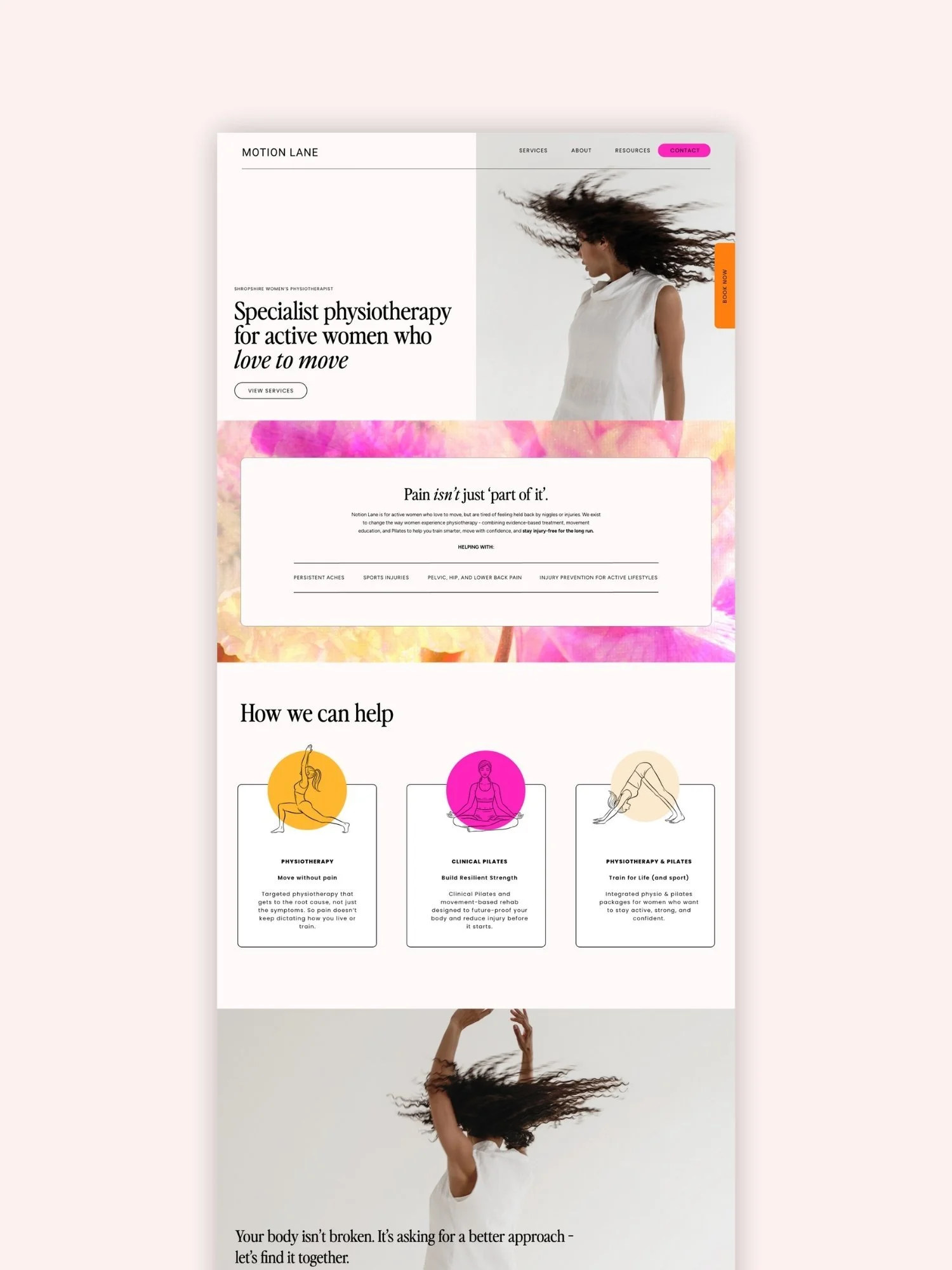
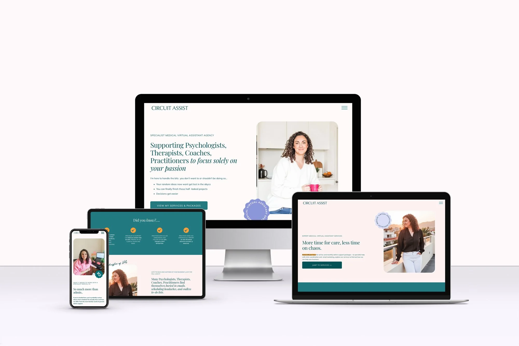
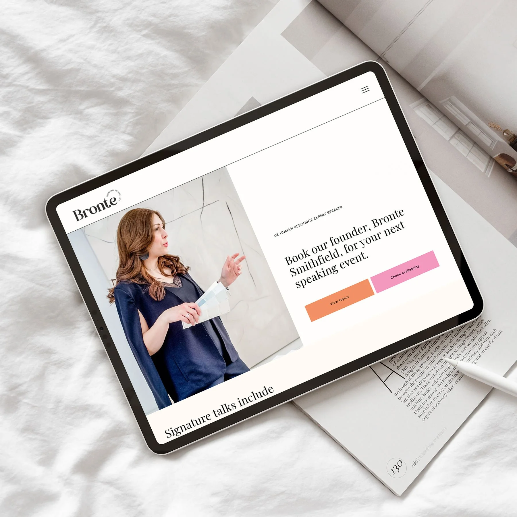
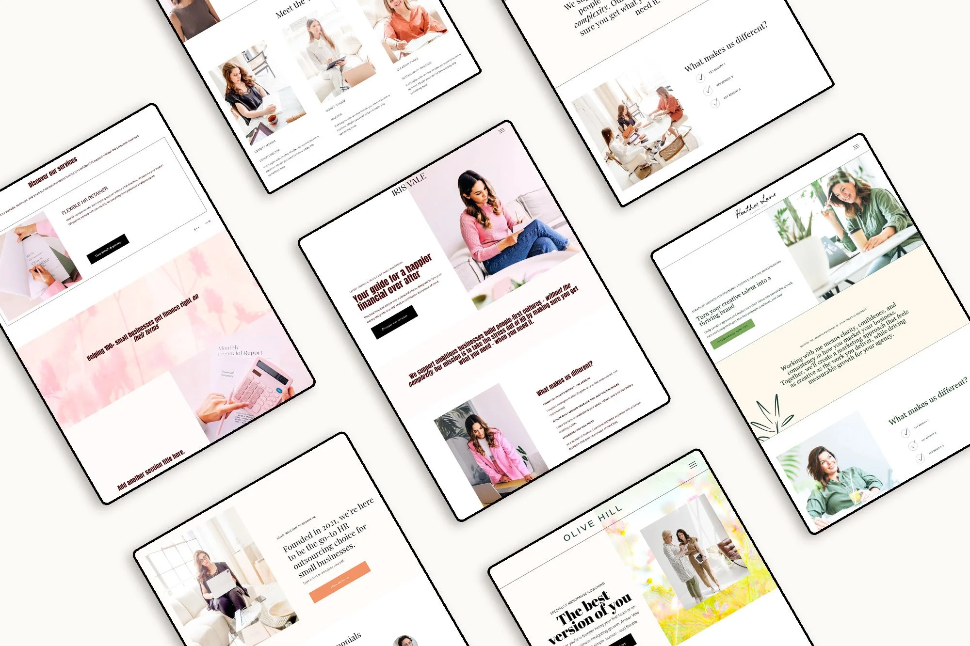
Inspiring clean website examples for small businesses
At Bright Avenue, clean design is all about simplicity, balance, and function.
Here are a few examples, but if you’d like to see more real-world examples, check out my portfolio at Bright Avenue.

Clean design mistakes to avoid
Clean design is all about making your site readable, easy to navigate, and trustworthy. But sometimes, in the quest for simplicity, important stuff gets lost. Or worse, your site ends up feeling a bit soulless.
1) Going too minimal
Minimalism is great until it makes your website feel a bit naked! In fact, strip away too much, and visitors might feel lost.
Don’t rely on white space alone. Add visual elements including headings, icons and graphics to guide people. And essential items such as menus, search bars, and calls to action must always be obvious.
2) Branding gets lost
Minimal doesn’t mean bland. Some sites go too far and visitors feel confused as your website doesn’t feel aligned with the rest of your brand.
Keep your brand alive with consistent fonts, brand visuals and a tone of voice that’s unmistakably yours. Leverage little things, like button shapes or image choices can show off your vibe without making the page busy.
FAQs
What are the must-haves for clean web design?
Use LOTS of white space to separate elements and cut the noise.
Wherever possible, stick to a simple colour palette - two or three colours that play well together.
Pick readable fonts; don’t go overly wild with typefaces. Navigation should be obvious, with clear menus and predictable page layouts.
Use high-quality images
Keep layouts and spacing consistent for a polished, professional feel.
How do you make sure a website is user-friendly?
Always start with clear navigation (your visitors shouldn’t have to guess where to click- and make sure you use labels that actually make sense!)
Watch your image sizes and make sure they are under 500kb - fast loading helps because nobody likes waiting!
Make contact options easy to spot, so visitors can reach out when they’re ready, or if they get stuck.
Final thoughts
As Paul Rand said, “Design is the silent ambassador of your brand.”
A clean website isn’t just about aesthetics. It’s about clarity, ease and trust. It’s about creating a space where your future clients don’t have to work things out, because everything feels clear and considered.
So it is truly set up to hold attention and build confidence in your business.
At Bright Avenue, crafting clean, fresh websites is at the heart of everything I do. My goal is to make design an extension of your message - not a distraction from it. This approach is perfect for small businesses and freelancers who want to quickly build trust and instil confidence with their website visitors.
Ready to build a website that moves visitors from searching to certain?
I help thoughtful, small business owners create beautiful, strategic and hardworking websites that truly reflect who they are — and book their perfect-fit clients.