Clean web design: how simplicity builds trust and clarity

Clean website design lets your message shine without all the noise.
And when your website feels clean, clear, and effortless to navigate, it connects better - it really is that simple
94% of first impressions of a website are design-related, with visitors forming an opinion in under 50 milliseconds (source: VWO).
At Bright Avenue, crafting clean, fresh websites is the foundation of every project. My ultimate goal is to make design an extension of the message, not a distraction from it.
This style is perfect for small businesses and freelancers who want to quickly build trust and show confidence through their design choices.
Because clean website design is all about removing distractions, guiding attention, and creating a clear, balanced layout that supports what you want to say.
As Paul Rand says “Design is the silent ambassador of your brand.”
Core principles of clean design at Bright Avenue
Emphasis on simplicity so the message is at the centre of the design
Clarity and readability
Thoughtful & intentional use of branding
1) Emphasis on simplicity so the message is at the centre of the design.
In web design, simplicity is key.
Every single element on your website should have a reason to be there. If something doesn’t help users understand or act on your message, it’s just clutter.
How is this achieved?
Stick to a considered colour palette
Use branding elements carefully
Keep spacing and layouts consistent (this is one of the easiest ways to create balance).
This makes your site easier to scan and cuts down on visual noise (absolutely crucial when your visitors have a huge number of other websites and social media fighting for their attention).
When people can find what they need fast, they stay focused on your message.
It really is win-win because simple layouts also load faster and play nicely with mobile devices.
And remember, simplicity doesn’t mean boring, it means every detail is intentional and structured.
2) Clarity & readability
As mentioned above, your visitors won’t spend time trying to find the information they need on your website. They’ll leave and search elsewhere.
This is the importance of clarity - it means visitors don’t have to work to figure things out. So:
Ensure menus are short
Make buttons text clear - visitors should always know where they’re going next
Use easy-to-read typography and make sure there’s enough contrast between text and background
Use visual hierarchy - bold key points, add headings, and use bullet lists to help people scan
Don’t bury people in long paragraphs, break things up
Use font sizes that work on all devices, and keep line spacing generous.
3) Thoughtful & intentional use of branding
A clean site doesn’t mean stripping away your brand identity.
The sweet spot is to use branding elements, including your colours, graphics, and images intentionally. That means - not everywhere, and not all at once!
Let your brand visuals support your message, not drown it out.
Use brand elements where they’ll actually make a difference in recognition and trust, for example:
Accent colours for buttons or links
Careful placement of graphics to add interest to sections.
Photography that fits your vibe and values
Consistent typography everywhere
When you balance clarity with personality, your site feels unique but it will still be incredibly easy to navigate.
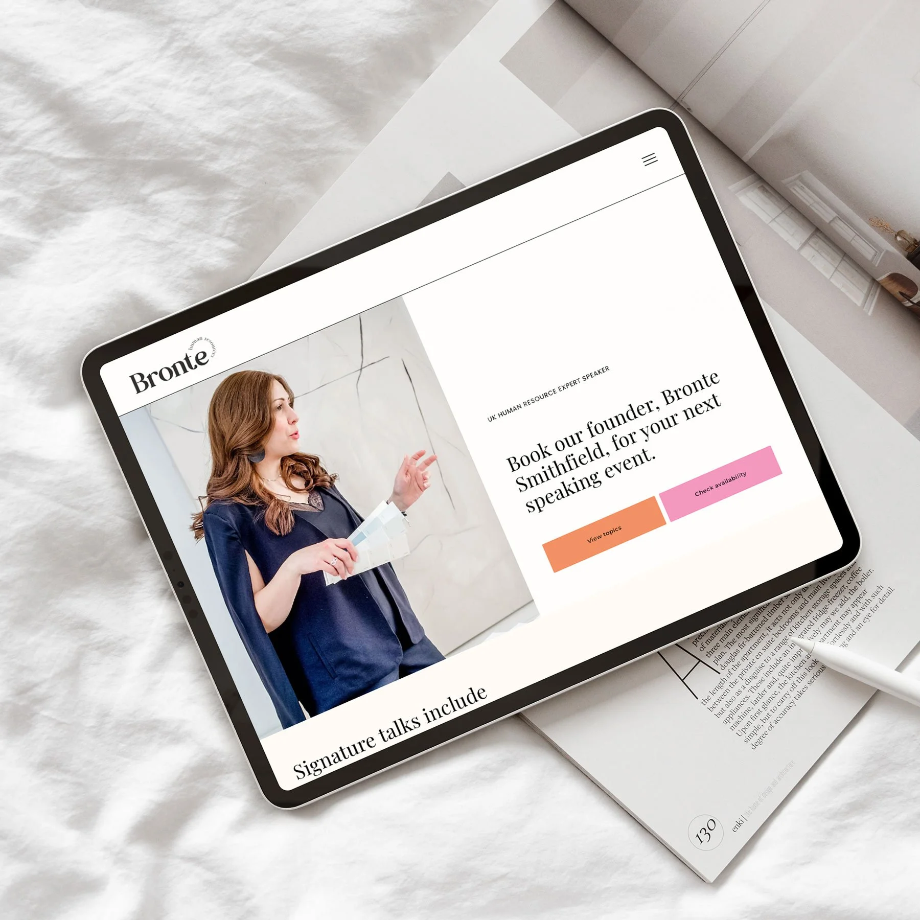
For instance, in my project for Novum Salons (see Bright Avenue), I used their signature bright turquoise sparingly to keep things cohesive and memorable.
Elements that support a clean layout
How you handle space, colour, type, and navigation shapes how people experience your site. These aren’t just design details - they’re how visitors remember your brand.
1) White space
White space lets your content breathe.
It separates ideas, reduces clutter, and draws the eye to what matters, like headlines or buttons.
Don’t cram things together. By grouping related elements together and leave space between sections, it’s amazing how much calmer and more organised your website will feel.
A simple layout grid helps keep spacing even. Used well, white space makes your site look modern and easy to scan.
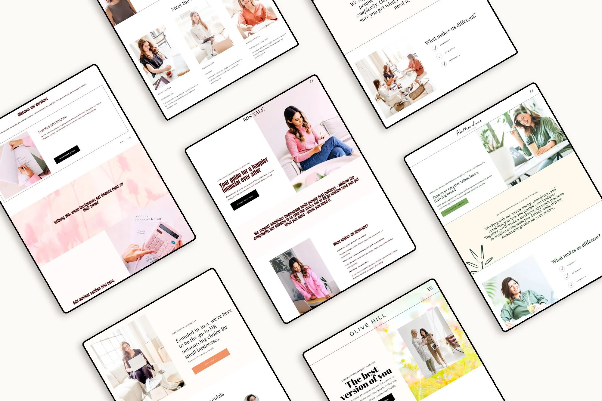
I used this approach when designing the Lark theme for my semi-custom Illuminate service —plenty of room allowing my client’s services and message to take centre stage.
2) Colour & branding visuals
Colour sets the mood. An intentional palette - usually two to three main colours and an accent or two keeps things cohesive and avoids distraction.
Choose colours that fit your brand. Muted tones feel professional. Bright hues create an energetic and creative vibe.
Note - always keep text high-contrast for readability.
Sprinkle in brand visuals, like icons and subtle patterns, but don’t go overboard. Here’s a quick rule of thumb:
| Element | Suggested colour use |
|---|---|
| Background | Neutral or light |
| Headings | Primary brand colour (darkest in your palette) |
| Buttons | Accent colour |
| Links | Consistent highlight |
3) Typography
Fonts matter. Stick to two or three typefaces - one for headings, one for body text, maybe a third for accents.
Web-safe, sans-serif fonts like Arial, Roboto, or Open Sans are clean and easy on the eyes. Keep font sizes and line spacing steady across your site.
Use headings to guide attention. Make them bigger or bolder than body text. Proper line spacing makes everything easier to read and keeps layouts from feeling cramped.
4) Navigation
Navigation should be obvious and easy. Main menus work best with five to seven top-level items. Labels should be clear - this really isn’t the time for guessing games.
Consider using a sticky header (one that stays at the top of the screen as visitors scroll through your site) helps people get around without backtracking. Add a simple footer menu for less important links.
Always remember, don’t overload navigation with too many choices. Keep menus, buttons, and icons in consistent places so users know where to look. It’s all about helping people find what they need without thinking twice.
User Experience
So far we’ve learned that clean design isn’t just about looks - it’s about making your site easy to use. Visitors should move through your content smoothly, find what they need quickly, and feel comfortable on any device.
1) Mobile first
Start with mobile. Most people are browsing on phones or tablets. Responsive layouts adjust to different screens, keeping content readable and navigation simple. No one wants to zoom or scroll sideways.
Prioritising mobile isn’t just good for users, it also helps you to be found in search engines and keeps people coming back.
2) Fast loading
Speed matters. If your site takes forever to load, visitors will leave - so compress images and reduce unnecessary scripts or plugins
Also keep layouts simple - fewer elements means less to load.
3) Accessible for all
Everyone should be able to use your site. Follow the Web Content Accessibility Guidelines (WCAG).
Add alt text to images, keep text and backgrounds high-contrast, and use clear link labels. Don’t rely on colour alone to get your point across.
Use headings in order so screen readers make sense of your content. And make sure keyboard navigation works for those who can’t use a mouse on your site.
Inspiring clean website examples for small businesses
At Bright Avenue, clean design is about simplicity, balance, and function.
Here are a few examples, but if you’d like to see more real-world examples, check out my portfolio at Bright Avenue - from a clean, simple website for an Illustrator to a bold, airy site for a personal brand, it’s always about letting the message lead.

Clean design mistakes to avoid
Clean design is all about making your site readable, easy to navigate, and trustworthy. But sometimes, in the quest for simplicity, important stuff gets lost. Or worse, your site ends up feeling a bit soulless.
1) Going too minimal
Minimalism is great until it turns your site into a guessing game. Strip away too much, and visitors might feel lost.
Don’t rely on white space alone. Add visual elements including headings, icons and graphics to guide people. Essential items like menus, search bars, and calls to action should always be obvious.
2) Branding gets lost
Minimal doesn’t mean bland. Some sites go too far and visitors feel confused as your website doesn’t feel aligned with the rest of your brand.
Keep your brand alive with consistent fonts, brand visuals and a tone of voice that’s unmistakably yours. Leverage little things, like button shapes or image choices can show off your vibe without making the page busy.
3) Flat content hierarchy
If everything looks the same, nothing stands out. Visitors won’t know where to look first…and that’s a recipe for confusion.
Use hierarchy to make headings bold, calls to action obvious, and break up text with short paragraphs or bullet lists. On mobile, double-check that spacing and font size still look good.
FAQs
What are the must-haves for clean web design?
Use lots of white space to separate elements and cut the noise. Wherever possible, stick to a simple colour palette - two or three shades that play well together.
Pick readable fonts; don’t go wild with typefaces. Navigation should be obvious, with clear menus and predictable page layouts.
Use high-quality images
Keep everything lined up for a polished, professional feel.
How do you make sure a website is user-friendly?
Always start with clear navigation (your visitors shouldn’t have to guess where to click- and make sure you use labels that actually make sense!)
Test your site different devices to make sure your website is mobile-friendly.
Watch your image sizes and make sure they are under 500kb - fast loading helps because nobody likes waiting!
Make contact options easy to spot, so visitors can reach out when they’re ready, or if they get stuck.
Final thoughts
A clean web design isn’t just about minimalism. It’s about clarity, usability and, ultimately, building trust.
Statistics show that users are more likely to stay, engage, and convert when your design is simple, fast, and visually consistent.
Ready to build a website that feels like you - and works?
I help thoughtful, small business owners create beautiful, strategic websites that truly reflect who they are — and support the work they’re here to do.